In previous posts [1] I showed how we can create custom Matlab app toolstrips using various controls (buttons, checkboxes, drop-downs, lists etc.). Today I will show how we can incorporate gallery panels into our Matlab toolstrip.

Toolstrips can be a bit complex to develop so I’m proceeding slowly, with each post in the miniseries building on the previous posts. I encourage you to review the earlier posts in the Toolstrip miniseries [1] before reading this post.
Also, remember to add the following code snippet at the beginning of your code so that the relevant toolstrip classes will be recognized by Matlab:
import matlab.ui.internal.toolstrip.*
Gallery sub-components

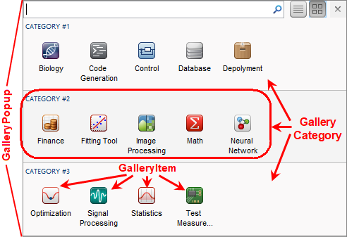
Gallery control), or as a drop-down button’s popup panel (a DropDownGalleryButton control). In either case, the displayed popup panel is a GalleryPopup object, that is composed of one or more GalleryCategory, each of which has one or more GalleryItem (push-button) and/or ToggleGalleryItem (toggle-button).
GalleryorDropDownGalleryButtonGalleryPopupGalleryCategoryGalleryItemorToggleGalleryItemGalleryItemorToggleGalleryItem- …
GalleryCategory- …
For a demonstration of toolstrip Galleries, see the code files in %matlabroot%/toolbox/matlab/toolstrip/+matlab/+ui/+internal/+desktop/, specifically showcaseToolGroup.m and showcaseBuildTab_Gallery.m.
GalleryPopup
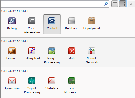
We first create the GalleryPopup object, then add to it a few GalleryCategory groups of GalleryItem, ToggleGalleryItem buttons. In the example below, we use a ButtonGroup to ensure that only a single ToggleGalleryItem button is selected:
import matlab.ui.internal.toolstrip.*
popup = GalleryPopup('ShowSelection',true);
% Create gallery categories
cat1 = GalleryCategory('CATEGORY #1 SINGLE'); popup.add(cat1);
cat2 = GalleryCategory('CATEGORY #2 SINGLE'); popup.add(cat2);
cat3 = GalleryCategory('CATEGORY #3 SINGLE'); popup.add(cat3);
% Create a button-group to control item selectability
group = matlab.ui.internal.toolstrip.ButtonGroup;
% Add items to the gallery categories
fpath = [fullfile(matlabroot,'toolbox','matlab','toolstrip','web','image') filesep];  % icons path
item1 = ToggleGalleryItem('Biology', Icon([fpath 'biology_app_24.png']), group);
item1.Description = 'Select the Biology gizmo';
item1.ItemPushedFcn = @(x,y) ItemPushedCallback(x,y);
cat1.add(item1);
item2 = ToggleGalleryItem('Code Generation', Icon([fpath 'code_gen_app_24.png']), group);
cat1.add(item2);
item3 = ToggleGalleryItem('Control', Icon([fpath 'control_app_24.png']), group);
cat1.add(item3);
item4 = ToggleGalleryItem('Database', Icon([fpath 'database_app_24.png']), group);
cat1.add(item4);
...

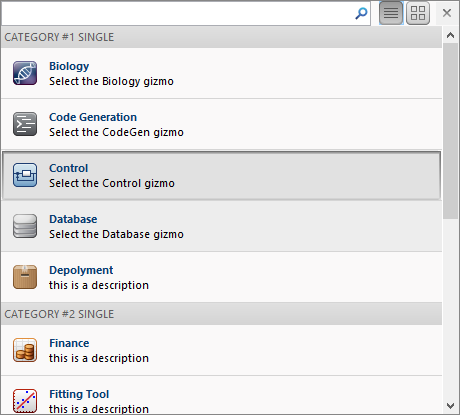
Note that in a real-world situation, we’d assign a Description, Tag and ItemPushedFcn to all gallery items. This was elided from the code snippet above for readability, but should be part of any actual GUI. The Description only appears as tooltip popup in icon-view (shown above), but appears as a visible label in list-view (see below).
Gallery items selection: push-button action, single-selection toggle, multiple selection toggle
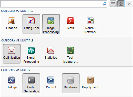
If we use ToggleGalleryItem without a ButtonGroup, multiple gallery items can be selected, rather than just a single selection as shown above:
...
item1 = ToggleGalleryItem('Biology', Icon([fpath 'biology_app_24.png']));
item1.Description = 'Select the Biology gizmo';
item1.ItemPushedFcn = @(x,y) ItemPushedCallback(x,y);
cat1.add(item1);
item2 = ToggleGalleryItem('Code Generation', Icon([fpath 'code_gen_app_24.png']));
cat1.add(item2);
item3 = ToggleGalleryItem('Control', Icon([fpath 'control_app_24.png']));
cat1.add(item3);
item4 = ToggleGalleryItem('Database', Icon([fpath 'database_app_24.png']));
cat1.add(item4);
...

Alternatively, if we use
GalleryItem instead of ToggleGalleryItem, the gallery items would be push-buttons rather than toggle-buttons. This enables us to present a gallery of single-action state-less push-buttons, rather than state-full toggle-buttons. The ability to customize the gallery items as either state-less push-buttons or single/multiple toggle-buttons supports a wide range of application use-cases.
Customizing the GalleryPopup
Properties that affect the GalleryPopup appearance are:
- DisplayState – initial display mode of gallery items (string; default=’icon_view’, valid values: ‘icon_view’,’list_view’)
- GalleryItemRowCount – number of rows used in the display of the in-line gallery (integer; default=1, valid values: 0,1,2). A Value of 2 should typically be used with a small icon and GalleryItemWidth (see below)
- GalleryItemTextLineCount – number of rows used for display of the item label (integer; default=2, valid values: 0,1,2)
- ShowSelection – whether or not to display the last-selected item (logical; default=false). Needs to be true for
Galleryand false forDropDownGalleryButton. - GalleryItemWidth – number of pixels to allocate for each gallery item (integer, hidden; default=80)
- FavoritesEnabled – whether or not to enable a “Favorites” category (logical, hidden; default=false)
All of these properties are defined as private in the GalleryPopup class, and can only be specified during the class object’s construction. For example, instead of the default icon-view, we can display the gallery items as a list, by setting the GalleryPopup‘s DisplayState property to 'list_view' during construction:
popup = GalleryPopup('DisplayState','list_view');

Switching from icon-view to list-view and back can also be done by clicking the corresponding icon near the popup’s top-right corner (next to the interactive search-box).
Gallery and DropDownGalleryButton
Now that we have prepared GalleryPopup, let’s integrate it in our toolstrip.
We have two choices — either in-line within the toolstrip section (using Gallery), or as a compact drop-down button (using DropDownGalleryButton):
% Inline gallery
section = hTab.addSection('Multiple Selection Gallery');
column = section.addColumn();
popup = GalleryPopup('ShowSelection',true);
% add the GalleryPopup creation code above
gallery = Gallery(popup, 'MinColumnCount',2, 'MaxColumnCount',4);
column.add(gallery);
% Drop-down gallery
section = hTab.addSection('Drop Down Gallery');
column = section.addColumn();
popup = GalleryPopup();
% add the GalleryPopup creation code above
button = DropDownGalleryButton(popup, 'Examples', Icon.MATLAB_24);
button.MinColumnCount = 5;
column.add(button);

Clicking any of the drop-down (arrow) widgets will display the associated
GalleryPopup.The
Gallery and DropDownGalleryButton objects have several useful settable properties:
- Popup – a
GalleryPopupobject handle, which is displayed when the user clicks the drop-down (arrow) widget. Only settable in the constructor, not after object creation. - MinColumnCount – minimum number of item columns to display (integer; default=1). In
Gallery, this property is only settable in the constructor, not after object creation; if not enough width is available to display these columns, the control collapses into a drop-down. InDropDownGalleryButton, this property can be set even after object creation (despite incorrect internal documentation), and controls the width of the popup panel. - MaxColumnCount – maximal number of items columns to display (integer; default=10). In
Gallery, this property is only settable in the constructor, not after object creation. InDropDownGalleryButton, this property can be set even after object creation but in any case seems to have no visible effect. - Description – tooltip text displayed when the mouse hovers over the
Galleryarea (outside the area of the internal gallery items, which have their own individual Descriptions), or over theDropDownGalleryButtoncontrol. - TextOverlay – a semi-transparent text label overlaid on top of the gallery panel (string, default=”). Only available in
Gallery, notDropDownGalleryButton.
For example:
gallery = Gallery(popup, 'MinColumnCount',2, 'MaxColumnCount',4);
gallery.TextOverlay = 'Select from these items';

Toolstrip miniseries roadmap
The next post will discuss popup forms. These are similar in concept to galleries, in the sense that when we click the drop-down widget a custom popup panel is displayed. In the case of a popup form, this is a fully-customizable Matlab GUI figure.
Following that, I plan to discuss toolstrip collapsibility, the Toolpack framework, docking layout, DataBrowser panel, QAB (Quick Access Bar), underlying Java controls, and adding toolstrips to figures – not necessarily in this order.
Matlab toolstrips can be a bit complex, so I plan to proceed in small steps, each post building on top of its predecessors.
If you would like me to assist you in building a custom toolstrip or GUI for your Matlab program, please let me know [2].
5 Comments To "Matlab toolstrip – part 8 (galleries)"
#1 Comment By gep On February 4, 2019 @ 12:33
Hello and thank you for all the toolstrip tips 🙂
I have one question w.r.t. to performance: assuming a gui app, not based on GUIDE, which is fairly optimized (I am following your advice/books for years), is there a significant overhead converting/using a toolstrip?
#2 Comment By Yair Altman On February 4, 2019 @ 12:40
@Gep – yes, apps and toolstrip take a few seconds to render before being ready. This is noticeably slower than corresponding legacy (Java-based figure) GUIs. Hopefully the performance will improve in future Matlab releases.
That being said, apps and toolstrips provide a radically different way for UI interactivity than the legacy GUI, and the performance impact might well be offset by the sleek-looking appearance. This tradeoff is not much different from that of AppDesigner-vs.-GUIDE — AppDesigner-created uifigures display much more polished UIs than GUIDE, yet are significantly slower to render.
The big benefit here is that you have a choice. You can decide for yourself, based on your specific needs and aesthetic preferences, whether to base your GUI on (1) pure legacy figures, or (2) a combination of apps/toolstrips/figures, or (3) pure AppDesigner/uifigures. I am a strong advocate of not hiding the full set of available tools from users, and letting users decide for themselves what’s best for them.
#3 Comment By Gep On February 4, 2019 @ 13:25
Thank you for your answer.
Except the initial performance hit you mentioned when rendering the figure with toolstrip for the first time, is there also a UI response degradation while using/updating the figure axes/contents assuming option 1 (pure legacy figures) ?
#4 Comment By Yair Altman On February 4, 2019 @ 13:29
I think the only major performance hit is in the initial rendering. I did not notice any sluggishness when updating the internal figures, but I never ran a thorough benchmark.
#5 Comment By Gep On February 4, 2019 @ 13:47
Can’t thank you enough for your quick response.
Hope the api doesn’t change much so we can play as long as possible 🙂