I would like to welcome Chris Parmer of plot.ly [1], who will describe the integration of Plotly graphs and charts in Matlab. Unlike the open-source JFreeChart [2] and Waterloo [3] plotting libraries that were described here in the past, Plotly is a commercial (not open-source) service. Contact Plotly for the exact license terms and costs. However, as you can see below, there’s a demo account that you can freely use. While I do not directly endorse Plotly as a commercial operation, I love its beautiful visualizations and interactivity. I think MathWorks would be wise to copy ideas from Plotly to Matlab’s graphics library, esp. new chart types and the interactivity features. In the future I hope that either Plotly concepts get included in Matlab’s HG, or that Plotly plots become embeddable in Matlab GUI (or both).
Plotly is a new web-based graphing application. You can interactively make, style, analyze and share beautiful graphs. Here is an example (move your mouse over the graph to see the interactive effects):
Full size: https://plot.ly/~chris/1638/ [4]
Additional examples: https://plot.ly/~bchartoff/603/ [5], https://plot.ly/~jackp/1000/ [6] and Washington Post [7].
Creating Plotly graphs in Matlab
Plotly has a Matlab interface. From Matlab, you send data to plotly where it will be stored and made into a graph that you view in your browser. Let’s get started.
- download [8] the Plotly-Matlab API package.
- Add folder and subfolders to your Matlab path:
path_to_downloaded_folder = '/User/chris/Downloads/plotly'; % fill in with your path
addpath(genpath(path_to_downloaded_folder))
- Sign up through the API, or sign-in with a demo account:
% To sign up, run: r = signup('my_desired_plotly_username', 'my_desired_plotly_username@my_email.com') % plotly generates a temp password and api_key for you signin(r.un, r.api_key); % then, sign in with your newly created account % OR to use the demo account, do: plotly_username = 'MATLAB_example' % a demo username you can use plotly_key = 'h5n38rzyjo' % a demo api key you can use signin(plotly_username, plotly_key) % sign in to plotly - Create a new chart using the API’s plotly function:
% Here's a simple line chart example:
>> x = linspace(0, 6*pi, 100);
>> y1 = exp(-0.2*x).*sin(x);
>> y2 = exp(-0.3*x).*sin(x);
>> r = plotly(x,y1,x,y2) % call plotly instead of plot
High five! You successfully sent some data to your account on plotly.
View your plot in your browser at https://plot.ly/~MATLAB_example/3 or inside your plot.ly account where it is named 'plot from API (3)'
ans =
   url: 'https://plot.ly/~MATLAB_example/3'
   message: [1x205 char]
   warning: [1x0 char]
   filename: 'plot from API (3)'
   error: [1x0 char]
And here’s the graph that you just generated: https://plot.ly/~MATLAB_example/3 [9]
Note that the graph won’t actually appear in a Matlab figure, nor can it be viewed in Matlab’s limited built-in browser (web). Instead, you view all of your plots in your “real” web browser, at the URL that plotly has returned. You can also have Matlab automatically open up the browser by running dos(['open ' r.url]) on a Mac, or dos(['start ' r.url]) on Windows. Within a webpage, you can embed it using an iframe tag (as I have done in this article), as follows:
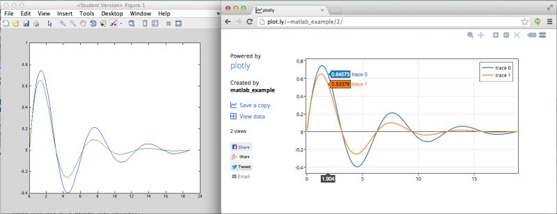
Here is a side-by-side comparison with the corresponding Matlab plot:
 [10]
[10]Customizing Plotly graphs
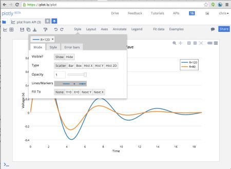
Every aspect of the plotly graph can be customized online. This means no more 500-line styling scripts! To open up the plot into the GUI, click the “Save a copy” button. You can also download the graphs to EPS, SVG, PNG, and PDF:
 [11]
[11]Plotly can make line charts, scatter plots, histograms, 2D histograms, box plots, heatmaps, and error bars. They also support log axes, date axes, multiple axes and subplots.
Plotly’s graphing syntax is a little unconventional. Plots are described with cell arrays of structs. Each struct describes a single “trace” of the plot with data, chart-type, and optional styling information. There are no setters or getters (Why? Well, because behind the scenes, the data gets converted to a JSON object and the closest analogue of a JSON array of key-value pair objects in Matlab is a cell array of structs). For example:
samples = randn(500,1); % 500 normally distributed samples
trace1 = struct('y', samples, ...
                'type', 'histogramy', ... % make a histogram type plot
                'histnorm', 'probability density'); % normalized by probability density distribution
trace2 = struct('x', linspace(-3,3,100), ...
                'y', 1./sqrt(2*pi)*exp(-linspace(-3,3,100).^2/2.), ...
                'fill', 'tozeroy') % "fill" the curve to the "zero-y" line i.e. make an area plot
response = plotly({trace1, trace2});  % => https://plot.ly/~MATLAB_example/5
Now let’s make some graphs not generally seen in Matlab 🙂
First, triple y-axis:
x = linspace(0,6*pi,100);
trace1 = struct('x',x, 'y',sin(x).*exp(-0.3*x));
trace2 = struct('x',x, 'y',10*sin(x-2*pi/3).*exp(-0.3*x), 'yaxis','y2'); % this trace will correspond to 2nd y-axis, 'y2'
trace3 = struct('x',x, 'y',100*sin(x-4*pi/3).*exp(-0.3*x), 'yaxis','y3'); % this trace will correspond to 3rd y-axis, 'y3'
layout = struct('xaxis', struct('domain',[0,0.9]), ... % set x-axis to span 90% of plot width, like Matlab's 'Position' property
                'yaxis2', struct('anchor','x', 'side','right', 'overlaying','y'), ... % places another y-axis on the right side of the plot
                'yaxis3', struct('anchor','side', 'right','free', 'position',1.0, 'overlaying','y')) % places 3rd y-axis at 100% plot width
r = plotly({trace1, trace2, trace3}, struct('layout', layout));  % => https://plot.ly/~MATLAB_example/13
dos(['open ', r.url])
Try clicking and dragging on the y-axis (along the number lines). Notice how each axes is totally independent of the other trace. Panning is done by dragging the x-axis. Also, try zooming (click-and-drag).
Here’s another neat example of how subplots’ axes can be linked to each other or can be independent:
x1 = [1, 2, 3];  y1 = [2,3,4];
x2 = [20,30,40]; y2 = [3,4,5];
x3 = [2, 3, 4];  y3 = [600,700,800];
x4 = [4000,5000,6000]; y4 = [7000,8000,9000];
% build structs describing the plot traces and assigning data to axes
trace1 = struct('x',x1, 'y',y1);
trace2 = struct('x',x2, 'y',y2, 'xaxis','x2', 'yaxis','y');  % new x-axis but same y-axis as trace1; 'x2' is shorthand for 'xaxis2' below
trace3 = struct('x',x3, 'y',y3, 'xaxis','x',  'yaxis','y3'); % same x-axis as trace 1 but a new y-axis
trace4 = struct('x',x4, 'y',y4, 'xaxis','x4', 'yaxis','y4'); % new x-axis and new y-axis
% build a layout struct describing the layout of the different axes
xaxis =  struct('domain', [0, 0.45]); % let the first x-axis span the first 45% of the plot width
yaxis =  struct('domain', [0, 0.45]); % and let the first y-axis span the first 45% of the plot height
xaxis2 = struct('domain', [0.55, 1]); % and let the second axis span the latter 45% of the plot width
yaxis3 = struct('domain', [0.55,1]);
xaxis4 = struct('domain', [0.55, 1], 'anchor','y4'); % anchor axis vertical position to start of yaxis4
yaxis4 = struct('domain', [0.55, 1], 'anchor','x4'); % anchor axis horizontal position to start of xaxis4
layout = struct('xaxis',xaxis, 'yaxis',yaxis, 'xaxis2',xaxis2, 'yaxis3',yaxis3, 'xaxis4',xaxis4, 'yaxis4',yaxis4);
r = plotly({trace1,trace2,trace3,trace4}, struct('=> layout', layout))  % => https://plot.ly/~MATLAB_example/15
dos(['open ', r.url])
The bottom two plots share the same y-axis, the two stacked plots on the left share the same y-axis, the two stacked plots on the left share the same x-axis and the plot in the top right has its own x and y axes. Try zooming (click-and-drag), auto-scaling (double-click), or axis panning (click-and-drag on the axes number lines) around in the different plots and see how the axes respond.
In case you don’t have the Matlab Stats toolbox, you can use plotly to make your box plots:
y1 = randn(50,1); y2 = rand(50,1);
r = plotly({struct('y',y1, 'type','box'), struct('y',y2, 'type','box')}) % => https://plot.ly/~MATLAB_example/17
dos(['open ', r.url])
In case you don’t have the Matlab Bioinformatics toolbox or Yair’s DataMatrix utility [12], you can use plotly to make your heatmaps:
r = plotly({struct('z',randn(50,50), 'type','heatmap')}) % => https://plot.ly/~matlab_example/18
dos(['open ', r.url])
Or, a different type of heat-map (click here for details [6]):
This was an introduction to the plotly-Matlab interface. Plotly is bridging desktop-based technical computing with the modern web. Inside the tool itself, you can share graphs and data with others (similarly to Google Docs), view revisions of your graph and data (similarly to GitHub), and even make graphs without coding by uploading a CSV, Excel, or even a .mat file. Since it’s entirely web-based, you can share your graphs and data with a link to anyone, even if they don’t have Matlab. There are also similar interfaces in Python, R, Perl, Julia, and Arduino, so if you or if you and your colleagues like to work in different languages, you can keep all of your data and graphs in the same place, online.
Last but not least, it’s much easier to make beautiful, publication-quality graphs. Here are some of our favorite examples:
Graphs: plot.ly/~carmeloosh/66/ [13], plot.ly/~flann321/9/ [14], plot.ly/~carmeloosh/81/ [15], plot.ly/~carmeloosh/83/ [16], plot.ly/~demos/444 [17], plot.ly/~demos/390 [18]
Scripts: plot.ly/MATLAB/script-demos/fractal-barnsley-fern-graph-example/ [19], plot.ly/MATLAB/script-demos/math-scores-boxplot-line-chart-example/ [20]
Additional resources
- Online-documentation: https://plot.ly/api/MATLAB/ [21]
- An online gallery: https://plot.ly/api/MATLAB/gallery/ [22]
- Plotly File Exchange utility: http://www.mathworks.com/matlabcentral/fileexchange/42202-plotly-api [23]
- The Matlab interface is open source on GitHub: https://github.com/plotly/MATLAB-api [24] (note that the plotly engine is not open-source, only the API)
- Plotly’s homepage: https://plot.ly/ [25]
- Email: chris [at] plot [dot] ly
4 Comments To "Plotly graphs"
#1 Comment By Jveer On December 6, 2013 @ 10:30
Great job guys!
Any chance of seeing 3D plots any time soon? To the very least 3D scatter plots?
#2 Comment By Emad (Matlab junkie) On January 9, 2014 @ 22:32
This is awesome. Definitely going to use this!
#3 Comment By varun chopra On February 28, 2014 @ 11:35
amazing!!!
#4 Pingback By What are some cool MATLAB tricks? | TechNote On August 5, 2015 @ 07:28
[…] Plug in with the Plotly MATLAB Graphing Library to make interactive web based graphs. See demo for code and interactive graphs: Plotly graphs | Undocumented Matlab. […]