Bar charts are a great way to visualize data. Matlab includes the bar function that enables displaying 2D bars in several different manners, stacked or grouped (there’s also bar3 for 3D bar-charts, and barh, bar3h for the corresponding horizontal bar charts).
Displaying stacked 1D data
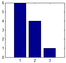
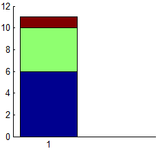
bar is basically a high-level m-file wrapper for the low-level specgraph.barseries object. Such wrappers are generally a good thing, assigning default property values, checking the input data for illegal values etc. But in some cases, they are simply too smart. One such case happened to me a few days ago, when I needed to display a stacked chart of some data values. This works great when the data is a 2D matrix, but when the data happens to be 1D (a single row), bar decides to display the values in separate bars (left screenshot), rather than in a single stacked bar (right screenshot), even when I specifically ask for a ‘stacked’ graph:
bar([6,4,1], 'Stacked');
I could of course revert to the lower-level specgraph.barseries. But in this case the simple workaround was to add a dummy data row of
Nan values, tricking bar into thinking it’s a 2D data. Since Nan values are never plotted in Matlab, we get the requested stacked bar, alongside an empty bar next to it. All we need to do now is to delete the extra tick-label for the dummy (empty) bar and we’re done:
bar([6,4,1; nan(1,3)], 'Stacked');
set(gca,'xtick',1)
or, more generally (taking care of both 2D and 1D data):
bar([data; nan(size(data))],'Stacked');
set(gca, 'xtick',1:size(data,1));
Displaying data labels
One of the features that I miss most in Matlab bar-charts is the ability to easily add data labels next to the colored patches. This can be added programmatically as I’ll just show, but it would be much better if there were properties that controlled this. Here’s my implementation:
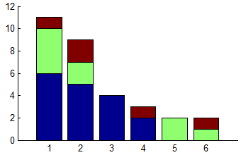
First, let’s display a simple stacked bar chart:
data = [6,4,1; 5,2,2; 4,0,0; 2,0,1; 0,2,0; 0,1,1];
hDataSeries = bar(data,'stacked');
set(gca, 'xlim',[0,7], 'box','off');
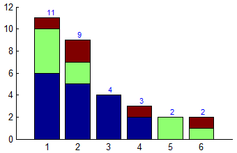
Now let’s add the bar totals on top of the bars:
sumTotals = sum(data,2);
sumTotals = sumTotals(~isnan(sumTotals));
labels = arrayfun(@num2str,sumTotals,'uniform',false);
hText = text(1:size(data,1), sumTotals, labels);
set(hText, 'VerticalAlignment','bottom', 'FontSize',8, 'Color','b');
Now let’s add the individual data-series labels, but only next to bars that have 2 or more components (if a bar only has a single patch component, then the top label is enough and there is no need for it to also appear on the side):
hPatches = get(hDataSeries,'Children');
try hPatches = cell2mat(hPatches); catch, end  % no need in case of single patch
xData = get(hPatches(1),'XData');
xPos = xData(end,:) + 0.01;
yData = get(hPatches,'YData');
try yData = cell2mat(yData); catch, end
barYs = yData(2:4:end,:);
barValues = diff([zeros(1,size(barYs,2)); barYs]);
barValues(bsxfun(@minus,barValues,sum(barValues))==0) = 0;  % no sub-total for bars having only a single sub-total
yPos = yData(1:4:end,:) + barValues/2;
xPos = xPos(ones(1,size(yPos,1)),:);
xPos(barValues==0)      = [];  % remove entries for empty bars patches
yPos(barValues==0)      = [];  % remove entries for empty bars patches
barValues(barValues==0) = [];  % remove entries for empty bars patches
labels = strcat(' ', arrayfun(@num2str,barValues(:),'uniform',false));
hText = text(xPos(:), yPos(:), labels);
set(hText, 'FontSize',8);
Finally, add the legend and we’re done:
hLegend = legend(hDataSeries, {'Blue','Green','Red'});
set(hLegend, 'FontSize',8);
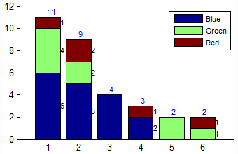
Additional customization of the bar patches can be made using the patch handles, which are included as children of the returned
hDataSeries handles:
hDataSeries = bar(...);
hPatches = get(hDataSeries, 'Children');
try hPatches = cell2mat(hPatches); catch, end  % no need in case of single patch
Note: hDataSeries is an array of handles, one per data column. Each handle is an hggroup of patches. As with all patches, we can customize their face and edge line-style, width, color, transparency, shading/lighting etc.
15 Comments To "Bar plot customizations"
#1 Comment By Yaroslav On June 5, 2014 @ 08:50
This is a known issue in Matlab’s high-level functions (plot, stem, mesh, etc.). For example,
will always plot a single line; but if we insist on three distinct lines, we must resort to the aforementioned
NaNtrick:However, using
NaN-s has a clear disadvantage in code readability and the requirement of many additional check-ups, which are better to be avoided in the first place. @Yair, is there any (undocumented) way to force Matlab to behave in a discrete level?#2 Comment By Yair Altman On June 5, 2014 @ 08:59
@Yaroslav – I am not aware of any simple way to do this without using either
NaNs or low-level plotting functions.#3 Comment By Julian On June 11, 2014 @ 07:13
Thanks for raising this.
In 2012 I sent the following report to the MathWorks (with respect to R2011a that I was running at the time):
My point was not accepted, but they keep changing the documentation in this area. In R2013a (that I use today) the documentation is not consistent between Grouped and Stacked. Looking at R2014a on MathWorks web-site there is the getout statement,
In my opinion this is a kludge. The doc is now mutually contradictory while the behaviour sucks! Clearly if you explicitly choose a grouped or stacked bar chart, by passing the flag, then orientation of matrix Y matters, and each row of Y is a group. It is quite legitimate to plot a single stack, and this is what we should expect bar() to do in that case.
#4 Comment By Sergey On August 19, 2014 @ 00:19
Thanks a lot for the very useful resource, Yair. Indeed in HG1 bar series can be treated as a set of patches and one can change a transparency using, e.g.
However in HG2 this code won’t work since bar object has no children. Do you know how to tackle this problem? Thanks a lot in advance!
#5 Comment By Yair Altman On August 19, 2014 @ 02:12
@Sergey –
To set all bar faces to the same color and alpha:
We can see the possible ColorType values by typing
hBar.Face.ColorType='<TAB>. We get the following list:colormapped, texturemapped, truecolor(default),truecoloralpha.We can see the possible ColorData values by trying some obviously invalid value:
This seems to indicate that there’s a way to set a 4xN color array, presumably for the separate bar faces (patches). Unfortunately, setting such an array directly is not enough:
So apparently we need to set some other property before being able to do this. I have still not found out exactly how to do this. If anyone finds out, please post a follow-on comment here. For reference, here’s what the Face object looks like:
>> hBar.Face.get
             AmbientStrength: 0.3
             BackFaceCulling: 'none'
                ColorBinding: 'object'
                   ColorData: [4x1 uint8]
                   ColorType: 'truecoloralpha'
             DiffuseStrength: 0.6
            HandleVisibility: 'on'
                     HitTest: 'off'
                       Layer: 'middle'
               NormalBinding: 'none'
                  NormalData: []
                      Parent: [1x1 Bar]
    SpecularColorReflectance: 1
            SpecularExponent: 10
            SpecularStrength: 0.9
                   StripData: [1 5 9 13]
                     Texture: []
            TwoSidedLighting: 'off'
                  VertexData: [3x12 single]
               VertexIndices: []
                     Visible: 'on'
Anyway, this is not a major limitation since we normally want all our bar faces to have consistent color and alpha. We can always use multiple bars, each having different color/alpha:
#6 Comment By Sergey On August 19, 2014 @ 04:00
Thank you very much, Yair. Apparently I need to read more about the HG2 and use “if-s” in my code for compatibility.
#7 Comment By Yair Altman On August 19, 2014 @ 04:21
or use try/catch
#8 Comment By Jared On October 26, 2014 @ 14:55
Here’s how to get multiple colors in a single Bar series. The ColorBinding can also be ‘interpolated’.
#9 Comment By Michael Cappello On July 25, 2015 @ 07:47
Yair (or anyone),
I have an application where I need to color the bars individually, and have tried to figure out how to get the handles of the underlying patches or graphical objects. I am doing this in HG2. Any ideas?
Thank you,
Mike
#10 Comment By Yaroslav On July 27, 2015 @ 22:59
So far, a smart solution is elusive; you can inspect Yair’s [7] for a detailed analysis. In the meanwhile, you can try the old-school simple approach:
N = 15;
hAxes = axes('NextPlot','add');
facecolors = jet(N);
for i = N : -1 : 1
    hBar(i) = bar(i, 2*i, 'FaceColor',facecolors(i,:));
end
#11 Comment By afaq On November 28, 2015 @ 04:25
Hi
I used the following code.
But I wanted to display the ranges of each stacked portion along its bar.
Please share if anyone knows how to display the ranges (limits of the each portion).
#12 Comment By NG Keerthy On July 13, 2016 @ 14:53
how to display the stack values for horizontal bar graph
#13 Comment By Yair Altman On July 17, 2016 @ 12:38
@NG – you will need to adapt the code in my post. This should not be too difficult: all the components are there, it’s basically just switching between X-Y etc., so I am not going to spoon-feed the answer. If you cannot do this (or don’t have time), then contact me by email for a short consulting.
#14 Comment By dgm On August 18, 2017 @ 23:57
Thanks for this solution. In addition to needing to label the individual bars, I have floating point numbers as the labels at the tops of the bars. Is there a way to center those labels over the bars instead of starting the text at the mid-point of each bar?
#15 Comment By Cyril On September 5, 2017 @ 15:13
Hi. I have a problem with making scatered bar graph in matlab.
I need to create graph where on X axis will be years from 2005 to 2016 and on Y axis will be another numbers.
If I use just simple number for example from 1 to 10 for X axis is working, but I need put years on X axis.
I use this example from web:
measles = [38556 24472 14556 18060 19549 8122 28541 7880 3283 4135 7953 1884]';
mumps = [20178 23536 34561 37395 36072 32237 18597 9408 6005 6268 8963 13882]';
chickenPox = [37140 32169 37533 39103 33244 23269 16737 5411 3435 6052 12825 23332]';

% Create a stacked bar chart using the bar function
figure
bar(1:12, [measles mumps chickenPox], 0.5, 'stack')

% Adjust the axis limits
axis([0 13 0 100000])
set(gca, 'XTick', 1:12)

% Add title and axis labels
title('Childhood diseases by month')
xlabel('Month')
ylabel('Cases (in thousands)')

% Add a legend
legend('Measles', 'Mumps', 'Chicken pox')
But then I repleaced nummbers for X axis (how you can see below), nad now is not working.
Some advice in this issue for me?
% Create data for application of fertilizer in arable land
dusikate = [70147.6	84165.8	92217.6	73166.4	85068.2	90982.2	98787.2	110714.4 116029.5 111892.1]';
fosforecne = [15757.9 19187.6 19828.2 13866.1 12797.9 14982.2 18898 20306.7 22497.4 21286.5]';
draselne = [13698.8	15764.6	16232.1	9798.1 8002.1 10108.4 13038.3 14534.1 16366.4 15868.7]';

x = 2005:1:2016;

% Create a stacked bar chart using the bar function
figure
bar(x,[dusikate fosforecne draselne], 0.8, 'stack')

% Adjust the axis limits
axis([50000 180000])
set(gca, 'XTick', x)
ax = gca;
ax.YAxis.Exponent = 0;

% Add title and axis labels
title({'Celková spotreba draselných, fosforečných a dusíkatých hnojív (v tonách) na';'sledovanej výmere ornej pôdy na Slovensku v období rokov 2005/2006 - 2014/2015'})
xlabel('sezóna (hospodársky rok')
ylabel('spotreba hnojív v tonách [t]')

% Add a legend
legend('dusikaté', 'fosforečné', 'draselné')