Earlier today, I was given the task of displaying a histogram plot of a list of values. In today’s post, I will walk through a few customizations that can be done to bar plots and histograms in order to achieve the desired results.
We start by binning the raw data into pre-selected bins. This can easily be done using the builtin histc (deprecated) or histcounts functions. We can then use the bar function to plot the results:
[binCounts, binEdges] = histcounts(data);
hBars = bar(hAxes, binEdges(1:end-1), binCounts);
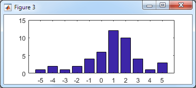
Basic histogram bar plot
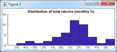
Let’s improve the appearance: In my specific case, the data was financial return (percentage) values, so let’s modify the x-label format accordingly and display a title. To make the labels and title more legible, we decrease the axes FontSize to 8 and remove the axes box:
hAxes = hBar.Parent;
xtickformat(hAxes, '%g%%');
title(hAxes, 'Distribution of total returns (monthly %)');
set(hAxes, 'FontSize',8, 'Box','off')
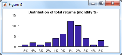
Improved histogram bar plot
So far nothing undocumented. Note that the xtickformat/ytickformat functions were only introduced in R2016b – for earlier Matlab releases see this post (which does rely on undocumented aspects).
Now, let’s use a couple of undocumented properties: to remove the excess white-space margin around the axes we’ll set the axes’ LooseInset property, and to remove the annoying white space between the tick labels and the X-axis we’ll set the XRuler‘s TickLabelGapOffset property to -2 (default: +2):
set(hAxes, 'LooseInset',[0,0,0,0]);    % default = [.13,.11,.095,.075]
hAxes.XRuler.TickLabelGapOffset = -2;  % default = +2
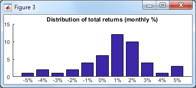
Even better histogram bar plot
Note that I used the undocumented axes XRuler property instead of the axes’ documented XAxis property, because XAxis is only available since R2015b, whereas XRuler (which points to the exact same object as XAxis) exists ever since R2014b, and so is better from a backward-compatibility standpoint. In either case, the ruler’s TickLabelGapOffset property is undocumented. Note that the ruler also contains another associated and undocumented TickLabelGapMultiplier property (default: 0.2), which I have not modified in this case.
Now let’s take a look at the bin labels: The problem with the bar plot above is that it’s not intuitively clear whether the bin for “5%”, for example, includes data between 4.5-5.5 or between 5.0-6.0 (which is the correct answer). It would be nicer if the labels were matched to the actual bin edges. There are 3 basic ways to fix this:
- We could modify the bar plot axes tick values and labels, in essence “cheating” by moving the tick labels half a bin leftward of their tick values (don’t forget to add the extra tick label on the right):
hAxes.XTick(end+1) = hAxes.XTick(end) + 1;  % extra tick label on the right
labels = hAxes.XTickLabels;       % preserve tick labels for later use below
hAxes.XTick = hAxes.XTick - 0.5;  % move tick labels 1/2 bin leftward
hAxes.XTickLabel = labels;        % restore pre-saved tick labels
hAxes.XLim = hAxes.XLim - 0.5;    % ...and align the XLim
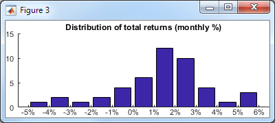
Improved labels
- We could use the bar function’s optional
'histc'flag, in order to display the bars in histogram mode. The problem in histogram mode is that while the labels are now placed correctly, the bars touch each other – I personally find distinct bars that are separated by a small gap easier to understand.hBars = bar(..., 'histc'); % [snip] - same customizations to hAxes as done above
Basic histogram plot
With the original bar chart we could use the built-in BarWidth to set the bar/gap width (default: 0.8 meaning a 10% gap on either side of the bar). Unfortunately, calling bar with
'hist'or'histc'(i.e. histogram mode) results in aPatch(notBar) object, and patches do not have a BarWidth property. However, we can modify the resulting patch vertices in order to achieve the same effect:% Modify the patch vertices (5 vertices per bar, row-based) hBars.Vertices(:,1) = hBars.Vertices(:,1) + 0.1; hBars.Vertices(4:5:end,1) = hBars.Vertices(4:5:end,1) - 0.2; hBars.Vertices(5:5:end,1) = hBars.Vertices(5:5:end,1) - 0.2; % Align the bars & labels at the center of the axes hAxes.XLim = hAxes.XLim + 0.5;
This now looks the same as option #1 above, except that the top-level handle is a
Patch(notBar) object. For various additional customizations, eitherPatchorBarmight be preferable, so you have a choice.
Improved histogram plot
- Lastly, we could have used the builtin histogram function instead of bar. This function also displays a plot with touching bars, as above, using
Quadrilateralobjects (a close relative ofPatch). The solution here is very similar to option #2 above, but we need to dig a bit harder to modify the patch faces, since their vertices is not exposed as a public property of theHistogramobject. To modify the vertices, we first get the private Face property (explanation), and then modify its vertices, keeping in mind that in this specific case the bars have 4 vertices per bar and a different vertices matrix orientation:hBars = histogram(data, 'FaceAlpha',1.0, 'EdgeColor','none'); % [snip] - same customizations to hAxes as done above % Get access to *ALL* the object's properties oldWarn = warning('off','MATLAB:structOnObject'); warning off MATLAB:hg:EraseModeIgnored hBarsStruct = struct(hBars); warning(oldWarn); % Modify the patch vertices (4 vertices per bar, column-based) drawnow; % this is important, won't work without this! hFace = hBarsStruct.Face; % a Quadrilateral object (matlab.graphics.primitive.world.Quadrilateral) hFace.VertexData(1,:) = hFace.VertexData(1,:) + 0.1; hFace.VertexData(1,3:4:end) = hFace.VertexData(1,3:4:end) - 0.2; hFace.VertexData(1,4:4:end) = hFace.VertexData(1,4:4:end) - 0.2;
In conclusion, there are many different ways to improve the appearance of charts in Matlab. Even if at first glance it may seem that some visualization function does not have the requested customization property or feature, a little digging will often find either a relevant undocumented property, or an internal object whose properties could be modified. If you need assistance with customizing your charts for improved functionality and appearance, then consider contacting me for a consulting session.

 One thing with the modified code is that it is necessary to add an attachment to send an...