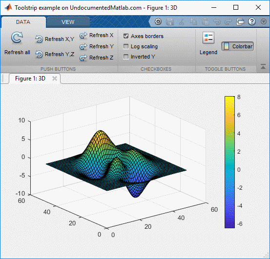
In a previous post I showed how we can create custom Matlab app toolstrips. Toolstrips can be a bit complex to develop so I’m trying to proceed slowly, with each post in the miniseries building on the previous posts. I encourage you to review the earlier posts in the Toolstrip miniseries before reading this post. In today’s post we continue the discussion of the toolstrip created in the previous post:

Toolstrip example (basic controls)
Today’s post will show how to attach user-defined functionality to toolstrip components, as well as some additional customizations. At the end of today’s article, you should be able to create a fully-functional custom Matlab toolstrip. Today’s post will remain within the confines of a Matlab “app”, i.e. a tool-group that displays docked figures. Future posts will discuss lower-level toolstrip mechanisms, that enable advanced customizations as well as integration in legacy (Java-based, even GUIDE-created) Matlab figures.
Control callbacks
Controls are useless without settable callbacks that affect the program state based on user interactions. There are two different mechanisms for setting callbacks for Matlab toolstrip controls. Refer to the example in the previous post:
- Setting the control’s callback property or properties – the property names differ across components (no, for some reason it’s never as simple as Callback in standard uicontrols). For example, the main action callback for push-buttons is ButtonPushedFcn, for toggle-buttons and checkboxes it’s ValueChangedFcn and for listboxes it’s . Setting the callback is relatively easy:
hColorbar.ValueChangedFcn = @toggleColorbar;

function toggleColorbar(hAction,hEventData)
    if hAction.Selected
        colorbar;
    else
        colorbar('off');
    end
end
The
hActionobject that is passed to the callback function as the first input arg contains various fields of interest, but for some reason the most important object property (Value) is renamed as the Selected property (most confusing). Also, a back-reference to the originating control (hColorbarin this example), which is important for many callbacks, is also missing (and no – I couldn’t find it in the hidden properties either):>> hAction hAction = Action with properties: Description: 'Toggle colorbar display' Enabled: 1 Shortcut: '' Selected: 1 QuickAccessIcon: [] SelectionChangedFcn: @toggleColorbar Text: 'Colorbar' IsInQuickAccess: 0 ButtonGroup: [] Icon: [1×1 matlab.ui.internal.toolstrip.Icon] >> hEventData hEventData = ToolstripEventData with properties: EventData: [1×1 struct] Source: [0×0 handle] EventName: '' >> hEventData.EventData ans = struct with fields: Property: 'Value' NewValue: 1 OldValue: 0
Note that
hEventData.Sourceis an empty handle for some unknown reason.The bottom line is that to reference the button state using this callback mechanism we need to either:
- Access
hAction‘s Selected property which stands-in for the originating control’s Value property (this is what I have shown in the short code snippet above) - Access
hEventData.EventDataand use its reported Property, NewValue and OldValue fields - Pass the originating control handle as an extra (3rd) input arg to the callback function, and then access it from within the callback. For example:
hColorbar.ValueChangedFcn = {@toggleColorbar, hColorbar};

function toggleColorbar(hAction,hEventData,hButton)
    if hButton.Value %hAction.Selected
        colorbar;
    else
        colorbar('off');
    end
end
- Access
- As an alternative, we can use the addlistener function to attach a callback to control events. Practically all toolstrip components expose public events that can be listened-to using this mechanism. In most cases the control’s callback property name(s) closely follow the corresponding events. For example, for buttons we have the ValueChanged event that corresponds to the ValueChangedFcn property. We can use listeners as follows:
hCheckbox.addlistener('ValueChanged',@toggleLogY);

function toggleLogY(hCheckbox,hEventData)
    if hCheckbox.Value, type = 'log'; else, type = 'linear'; end
    set(gca, 'XScale',type, 'YScale',type, 'ZScale',type);
end
Note that when we use the addlistener mechanism to attach callbacks, we don’t need any of the tricks above – we get the originating control handle as the callback function’s first input arg, and we can access it directly.
Unfortunately, we cannot pass extra args to the callback that we specify using addlistener (this seems like a trivial and natural thing to have, for MathWorks’ attention…). In other words, addlistener only accepts a function handle as callback, not a cell array. To bypass this limitation in uicontrols, we typically add the extra parameters to the control’s UserData or ApplicationData properties (the latter via the setappdata function). But alas – toolstrip components have neither of these properties, nor can we add them in runtime (as with for other GUI controls). So we need to find some other way to pass these extra values, such as using global variables, or making the callback function nested so that it could access the parent function’s workspace.
Additional component properties
Component text labels, where relevant, can be set using the component’s Text property, and the tooltip can be set via the Description property. As I noted in my previous post, I believe that this is an unfortunate choice of property names. In addition, components have control-specific properties such as Value (checkboxes and toggle buttons). These properties can generally be modified in runtime, in order to reflect the program state. For example, we can disable/enable controls, and modify their label, tooltip and state depending on the control’s new state and the program state in general.
The component icon can be set via the Icon property, where available (for example, buttons have an icon, but checkboxes do not). There are several different ways in which we can set this Icon. I will discuss this in detail in the following post; in the meantime you can review the usage examples in the previous post.
There are a couple of additional hidden component properties that seem promising, most notably Shortcut and Mnemonic (the latter (Mnemonic) is also available in Section and Tab, not just in components). Unfortunately, at least as of R2018b these properties do not seem to be connected yet to any functionality. In the future, I would expect them to correspond to keyboard shortcuts and underlined mnemonic characters, as these functionalities behave in standard menu items.
Accessing the underlying Java control
As long as we’re not displaying the toolstrip on a browser page (i.e., inside a uifigure or Matlab Online), the toolstrip is basically composed of Java Swing components from the com.mathworks.toolstrip.components package (such as TSButton or TSCheckBox). I will discuss these Java classes and their customizations in a later post, but for now I just wish to show how to access the underlying Java component of any Matlab MCOS control. This can be done using a central registry of toolstrip components (so-called “widgets”), which is accessible via the ToolGroup‘s hidden ToolstripSwingService property, and then via each component’s hidden widget Id. For example:
>> widgetRegistry = hToolGroup.ToolstripSwingService.Registry;
>> jButton = widgetRegistry.getWidgetById(hButton.getId)  % get the hButton's underlying Java control
ans =
com.mathworks.toolstrip.components.TSToggleButton[,"Colorbar",layout<>,NORMAL]
We can now apply a wide variety of Java-based customizations to the retrieved jButton, as I have shown in many other articles on this website over the past decade.
Another way to access the toolstrip Java component hierarchy is via hToolGroup.Peer.get(tabIndex).getComponent. This returns the top-level Java control representing the tab whose index in tabIndex (0=left-most tab):
>> jToolGroup = hToolGroup.Peer;  % or: =hToolGroup.ToolstripSwingService.SwingToolGroup;
>> jDataTab = jToolGroup.get(0).getComponent;  % Get tab #0 (first tab: "Data")
>> jDataTab.list   % The following is abridged for brevity
com.mathworks.toolstrip.impl.ToolstripTabContentPanel[tab0069230a-52b0-4973-b025-2171cd96301b,0,0,831x93,...]
 SectionWrapper(section54fb084c-934d-4d31-9468-7e4d66cd85e5)
  com.mathworks.toolstrip.impl.ToolstripSectionComponentWithHeader[,0,0,241x92,...]
   com.mathworks.toolstrip.components.TSPanel[section54fb084c-934d-4d31-9468-7e4d66cd85e5,,layout<HORIZONTAL>,NORMAL]
    TSColumn -> layout<> :
     com.mathworks.toolstrip.components.TSButton[,"Refresh all",layout<>,NORMAL]
    TSColumn -> layout<> :
     com.mathworks.toolstrip.components.TSButton[,"Refresh X,Y",layout<>,NORMAL]
     com.mathworks.toolstrip.components.TSButton[,"Refresh Y,Z",layout<>,NORMAL]
    TSColumn -> layout<> :
     com.mathworks.toolstrip.components.TSButton[,"Refresh X",layout<>,NORMAL]
     com.mathworks.toolstrip.components.TSButton[,"Refresh Y",layout<>,NORMAL]
     com.mathworks.toolstrip.components.TSButton[,"Refresh Z",layout<>,NORMAL]
 SectionWrapper(sectionebd8ab95-fd33-4a3d-8f24-152589713994)
  com.mathworks.toolstrip.impl.ToolstripSectionComponentWithHeader[,0,0,159x92,...]
   com.mathworks.toolstrip.components.TSPanel[sectionebd8ab95-fd33-4a3d-8f24-152589713994,,layout<HORIZONTAL>,NORMAL]
    TSColumn -> layout<> :
     com.mathworks.toolstrip.components.TSCheckBox[,"Axes borders",layout<>,NORMAL]
     com.mathworks.toolstrip.components.TSCheckBox[,"Log scaling",layout<>,NORMAL]
     com.mathworks.toolstrip.components.TSCheckBox[,"Inverted Y",layout<>,NORMAL]
 SectionWrapper(section01995bfd-61de-490f-aa22-de50bae1af75)
  com.mathworks.toolstrip.impl.ToolstripSectionComponentWithHeader[,0,0,125x92,...]
   com.mathworks.toolstrip.components.TSPanel[section01995bfd-61de-490f-aa22-de50bae1af75,,layout<HORIZONTAL>,NORMAL]
    TSColumn -> layout<> :
     com.mathworks.toolstrip.components.TSToggleButton[,"Legend",layout<>,NORMAL]
    TSColumn -> layout<> :
     com.mathworks.toolstrip.components.TSLabel[null," ",layout<>,NORMAL]
     com.mathworks.toolstrip.components.TSToggleButton[,"Colorbar",layout<>,NORMAL]
     com.mathworks.toolstrip.components.TSLabel[null," ",layout<>,NORMAL]
 com.mathworks.mwswing.MJButton[toolstrip.header.collapseButton,808,70,20x20,...]
Toolstrip miniseries roadmap
The next post will discuss icons, for both toolstrip controls as well as the ToolGroup app window.
I plan to discuss complex components in subsequent posts. Such components include button-group, drop-down, listbox, split-button, slider, popup form, gallery etc.
Following that, my plan is to discuss toolstrip collapsibility, the ToolPack framework, docking layout, DataBrowser panel, QAB (Quick Access Bar), underlying Java controls, and adding toolstrips to figures – not necessarily in this order.
Have I already mentioned that Matlab toolstrips can be a bit complex?
If you would like me to assist you in building a custom toolstrip or GUI for your Matlab program, please let me know.
Happy New Year, everyone!


 One thing with the modified code is that it is necessary to add an attachment to send an...