In previous posts I showed how we can create custom Matlab app toolstrips using controls such as buttons, checkboxes, sliders and spinners. Today I will show how we can incorporate even more complex selection controls into our toolstrip: lists, drop-downs, popups etc.

Toolstrips can be a bit complex to develop so I’m proceeding slowly, with each post in the miniseries building on the previous posts. I encourage you to review the earlier posts in the Toolstrip miniseries before reading this post.
Also, remember to add the following code snippet at the beginning of your code so that the relevant toolstrip classes will be recognized by Matlab:
import matlab.ui.internal.toolstrip.* |
There are 4 types of popups in toolstrip controls:
- Builtin dropdown (combo-box) selector similar to the familiar uicontrol(‘style’,’popup’,…). In toolstrips, this is implemented using the
DropDowncontrol. - A more complex dropdown selector having icons and tooltips, implemented using the
DropDownButtonandSplitButtontoolstrip controls. - An even-more complex drop-down selector, which presents a gallery of options. This will be discussed in detail in the next post.
- A fully-customizable form panel (“popup form”). This will be discussed separately, in the following post.
DropDown
The simple DropDown toolstrip control is very easy to set up and use:
hPopup = DropDown({'Label1';'Label2';'Label3'}); hPopup.Value = 'Label3'; hPopup.ValueChangedFcn = @ValueChangedCallback; |

We can have the control hold a different value for each of the displayed labels, by specifying the input items as an Nx2 cell-array:
items = {'One', 'Label1'; ... 'Two', 'Label2'; ... 'Three', 'Label3'} hPopup = DropDown(items); hPopup.Value = 'Two'; hPopup.ValueChangedFcn = @ValueChangedCallback; |
This drop-down control will display the labels “Label1”, “Label2” (initially selected), and “Label3”. Whenever the selected drop-down item is changed, the corresponding popup Value will change to the corresponding value. For example, when “Label3” is selected in the drop-down, hPopup.Value will change to ‘Three’.
Another useful feature of the toolstrip DropDown control is the Editable property (logical true/false, default=false), which enables the user to modify the entry in the drop-down’s editbox. Any custom text entered within the editbox will update the control’s Value property to that string.
ListBox
We can create a ListBox in a very similarly manner to DropDown. For example, the following code snippet creates a list-box that spans the entire toolstrip column height and has 2 of its items initially selected:
hColumn = hSection.addColumn('Width',100); allowMultiSelection = true; items = {'One','Label1'; 'Two','Label2'; 'Three','Label3'; 'Four','Label4'; 'Five','Label5'}; hListBox = ListBox(items, allowMultiSelection); hListBox.Value = {'One'; 'Three'}; hListBox.ValueChangedFcn = @ValueChangedCallback; hColumn.add(hListBox); |

The
DropDown and ListBox controls are nearly identical in terms of their properties, methods and events/callbacks, with the following notable exceptions:
ListBoxcontrols do not have an Editable propertyListBoxcontrols have a MultiSelect property (logical, default=false), whichDropDowns do not have. Note that this property can only be set during theListBox‘s creation, as shown in the code snippet above.
DropDownButton and SplitButton
A more elaborate drop-down selector can be created using the DropDownButton and SplitButton toolstrip controls. For such controls, we create a PopupList object, and add elements to it, which could be any of the following, in whichever order that you wish:
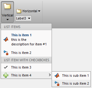
PopupListHeader– a section header (title), non-selectableListItem– a selectable list item, with optional Icon, Text, and Description (tooltip string, which for some reason [probably a bug] is not actually shown). For some reason (perhaps a bug), the Description is not shown in a tooltip (no tooltip is displayed). However, it is displayed as a label beneath the list-item’s main label, unless we set ShowDescription to false.ListItemWithCheckBox– a selectable list item that toggles a checkmark icon based on the list item’s selection Value (on/off). The checkmark icon is not customizable (alas).ListItemWithPopup– a non-selectable list item, that displays a sub-menu (anotherPopupListthat should be set to the parent list-item’s Popup property).
A simple usage example (adapted from the showcaseToolGroup demo):

function hPopup = createPopup() import matlab.ui.internal.toolstrip.* hPopup = PopupList(); % list header #1 header = PopupListHeader('List Items'); hPopup.add(header); % list item #1 item = ListItem('This is item 1', Icon.MATLAB_16); item.Description = 'this is the description for item #1'; item.ShowDescription = true; item.ItemPushedFcn = @ActionPerformedCallback; hPopup.add(item); % list item #2 item = ListItem('This is item 2', Icon.SIMULINK_16); item.Description = 'this is the description for item #2'; item.ShowDescription = false; addlistener(item, 'ItemPushed', @ActionPerformedCallback); hPopup.add(item); % list header #2 header = PopupListHeader('List Item with Checkboxes'); hPopup.add(header); % list item with checkbox item = ListItemWithCheckBox('This is item 3', true); item.ValueChangedFcn = @PropertyChangedCallback; hPopup.add(item); % list item with popup item = ListItemWithPopup('This is item 4',Icon.ADD_16); item.ShowDescription = false; hPopup.add(item); % Sub-popup hSubPopup = PopupList(); item.Popup = hSubPopup; % sub list item #1 sub_item1 = ListItem('This is sub item 1', Icon.MATLAB_16); sub_item1.ShowDescription = false; sub_item1.ItemPushedFcn = @ActionPerformedCallback; hSubPopup.add(sub_item1); % sub list item #2 sub_item2 = ListItem('This is sub item 2', Icon.SIMULINK_16); sub_item2.ShowDescription = false; sub_item2.ItemPushedFcn = @ActionPerformedCallback; hSubPopup.add(sub_item2); end % createPopup() |
We now have two alternatives for attaching this popup to the DropDownButton or SplitButton: 
- Static popup – set the Popup property of the button or
ListItemWithPopupto the popup-creation function (orhPopup). The popup will be created once and will remain unchanged throughout the program execution. For example:hButton = DropDownButton('Vertical', Icon.OPEN_24); hButton.Popup = createPopup();
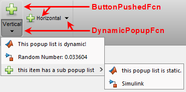
- Dynamic popup – set the DynamicPopupFcn of the button or
ListItemWithPopupto the popup creation function. This function will be invoked separately whenever the user clicks on the drop-down selector widget. Inside our popup-creation function we can have state-dependent code that modifies the displayed list items depending on the state of our program/environment. For example:hButton = SplitButton('Vertical', Icon.OPEN_24); hButton.ButtonPushedFcn = @ActionPerformedCallback; % invoked when user clicks the main split-button part hButton.DynamicPopupFcn = @(h,e) createPopup(); % invoked when user clicks the drop-down selector widget
DropDownButton and SplitButton are exactly the same as far as the popup-list is concerned: If it is set via the Popup property then the popup is static (in the sense that it is only evaluated once, when created), and if it is set via DynamicPopupFcn then the popup is dynamic (re-created before display). The only difference between DropDownButton and SplitButton is that in addition to the drop-down control, a SplitButton also includes a regular push-button control (with its corresponding ButtonPushedFcn callback).
In summary:
- If DynamicPopupFcn is set to a function handle, then the
PopupListthat is returned by that function will be re-evaluated and displayed whenever the user clicks the main button of aDropDownButtonor the down-arrow part of aSplitButton. This happens even if the Popup property is also set i.e., DynamicPopupFcn has precedence over Popup; when both of them are set, Popup is silently ignored (it would be useful for Matlab to display a warning in such cases, hopefully in a future release). - If DynamicPopupFcn is not set but Popup is (to a
PopupListobject handle), then thisPopupListwill be computed only once (when first created) and then it will be displayed whenever the user clicks the main button of aDropDownButtonor the down-arrow part of aSplitButton. - Separately from the above, if a
SplitButton‘s ButtonPushedFcn property is set to a function handle, then that function will be evaluated whenever the user clicks the main button of theSplitButton. No popup is presented, unless of course the callback function displays a popup programmatically. Note that ButtonPushedFcn is a property ofSplitButton; this property does not exist in aDropDownButton.
Important note: whereas DropDown and ListBox have a ValueChangedFcn callback that is invoked whenever the drop-down/listbox Value has changed, the callback mechanism is very different with DropDownButton and SplitButton: here, each menu item has its own individual callback that is invoked when that item is selected (clicked): ItemPushedFcn for ListItem; ValueChangedFcn for ListItemWithCheckBox; and DynamicPopupFcn for ListItemWithPopup. As we shall see later, the same is true for gallery items – each item has its own separate callback.
Galleries
Toolstrip galleries are panels of buttons (typically large icons with an attached text label), which are grouped in “categories”.
The general idea is to first create the GalleryPopup object, then add to it a few GalleryCategory groups, each consisting of GalleryItem (push-buttons) and/or ToggleGalleryItem (toggle-buttons) objects. Once this GalleryPopup is created, we can either integrate it in-line within the toolstrip section (using Gallery), or as a compact drop-down button (using DropDownGalleryButton):
% Inline gallery section = hTab.addSection('Multiple Selection Gallery'); column = section.addColumn(); popup = GalleryPopup('ShowSelection',true); % add the GalleryPopup creation code (see next week's post) gallery = Gallery(popup, 'MaxColumnCount',4, 'MinColumnCount',2); column.add(gallery); % Drop-down gallery section = hTab.addSection('Drop Down Gallery'); column = section.addColumn(); popup = GalleryPopup(); % add the GalleryPopup creation code (see next week's post) button = DropDownGalleryButton(popup, 'Examples', Icon.MATLAB_24); button.MinColumnCount = 5; column.add(button); |

I initially planned to include all the relevant Gallery discussion here, but it turned out to require so much space that I decided to devote a separate article for it — this will be the topic of next week’s blog post.
Toolstrip miniseries roadmap
The next post will discuss Galleries in depth, followed by popup forms.
Following that, I plan to discuss toolstrip collapsibility, the ToolPack framework, docking layout, DataBrowser panel, QAB (Quick Access Bar), underlying Java controls, and adding toolstrips to figures – not necessarily in this order.
Matlab toolstrips can be a bit complex, so I plan to proceed in small steps, each post building on top of its predecessors.
If you would like me to assist you in building a custom toolstrip or GUI for your Matlab program, please let me know.


hi Yair
this series about toolstrips is really cool and i appreciate your effort explaining so many concepts about it. Is it possible to customize toolstrips for a simple GUI or this only works for toolgroups?
best
Ramiro
I plan to discuss integration of the toolstrip in figures in a future post of this miniseries
Hello Yair,
I appreciate your effort for this series. It really changed my approach to MATLAB UI design. I think on moving from the GUI Layout Toolbox provided by David Sampson to toolstrips once I feel more comfortable with them.
My question is, is it possible to get the handle to the window containing the ToolGroup before or after it is created (i.e. hToolGroup.open()). I would like to use the new WindowState property of the figure window that came with the R2018a. My aim is to display the ToolGroup in fullscreen mode when it is opened.
Or is there any other workaround for this issue? Thank you for your time.
I plan to discuss positioning, docking and sizing in a near-future post in this miniseries. Stay tuned 🙂
Yair,
Great Post..!
How can we add control similar to [ View (Tab) –> Tiles (Column) –> Custom (Drop-Down Button)] ??
Thanks..!
I plan to discuss popup forms (a.k.a. “tear-off dialogs”) in a future post in this miniseries. Stay tuned 🙂
In the meantime, you can integrate the underlying
MJDimensionPickercontrol directly in your figure GUI:How do we put “MJDimensionPicker” in a “TSdropDownButton”? (As it is in [ View (Tab) –> Tiles (Column) –> Custom (Drop-Down Button)] ). Thanks again for the great articles.